Yuan Tian
PhD life | Computer & Health Science | Music and Dance | Views Are My Own
R for Data Science: Get ALL the Exercises Done!
 Reference: R for Data Science: Import, Tidy, Transform, Visualize, and Model Data
Using R Markdown together with exercises in each chapter of this book, I am trying to document my learning path on R. “How to get started with R Markdown”, and the R Markdown Cheatsheet are good reference sources for R Markdown.
This article will have tons of examples regarding what R can do for Data Science.
1. Data Visulization with ggplot2
After installing the tidyverse package, load the tidyverse by running this code only once:
library(tidyverse)The mpg dataset examples
The mpg data which contains the US Environment Protection Agency on 38 models of cars will be used for graph plotting.
mpg
## # A tibble: 234 x 11
##    manufacturer model    displ  year   cyl trans   drv     cty   hwy fl    class
##    <chr>        <chr>    <dbl> <int> <int> <chr>   <chr> <int> <int> <chr> <chr>
##  1 audi         a4         1.8  1999     4 auto(l~ f        18    29 p     comp~
##  2 audi         a4         1.8  1999     4 manual~ f        21    29 p     comp~
##  3 audi         a4         2    2008     4 manual~ f        20    31 p     comp~
##  4 audi         a4         2    2008     4 auto(a~ f        21    30 p     comp~
##  5 audi         a4         2.8  1999     6 auto(l~ f        16    26 p     comp~
##  6 audi         a4         2.8  1999     6 manual~ f        18    26 p     comp~
##  7 audi         a4         3.1  2008     6 auto(a~ f        18    27 p     comp~
##  8 audi         a4 quat~   1.8  1999     4 manual~ 4        18    26 p     comp~
##  9 audi         a4 quat~   1.8  1999     4 auto(l~ 4        16    25 p     comp~
## 10 audi         a4 quat~   2    2008     4 manual~ 4        20    28 p     comp~
## # ... with 224 more rows
To plot mpg, creat a graph with displ as x-axis and hwy as y-axis.
ggplot(data=mpg)+
  geom_point(mapping=aes(x=displ,y=hwy))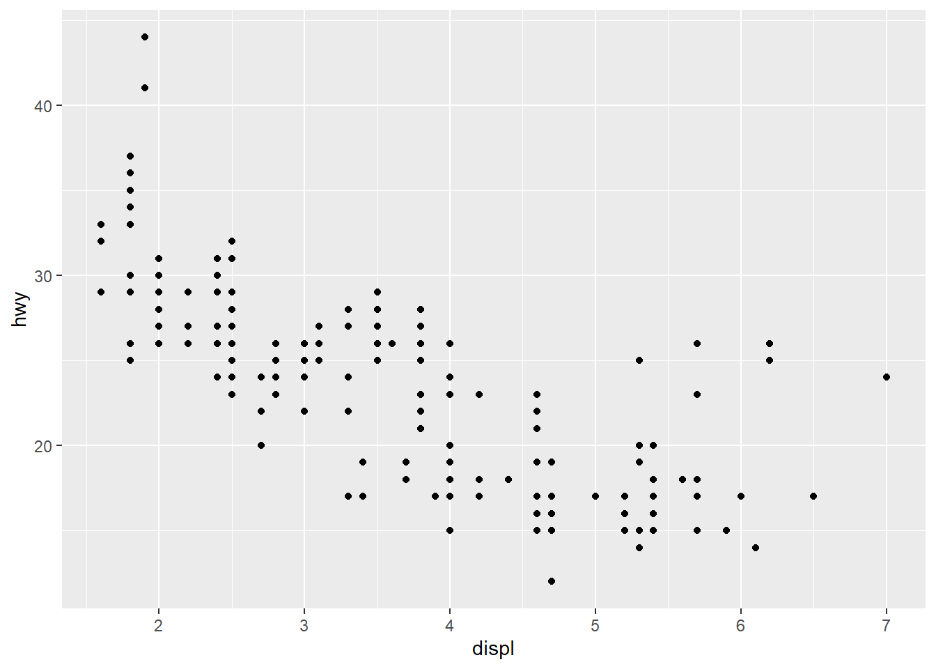
Make a scatterplot of hwy versus cyl.
ggplot(data=mpg)+
  geom_point(mapping=aes(x=hwy,y=cyl))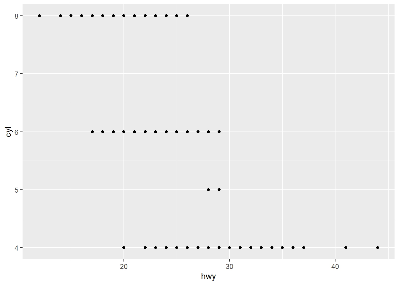
Add class variable to review the class of each car in scatterplot of displ and hwy. Try the size,color,alpha, and shapeoptions within aes().
## A slightly different way of coding to draw the graph.
ggplot(data=mpg, mapping=aes(displ,hwy))+
  geom_point()
ggplot(data=mpg)+
  geom_point(mapping=aes(x=displ,y=hwy,color=class))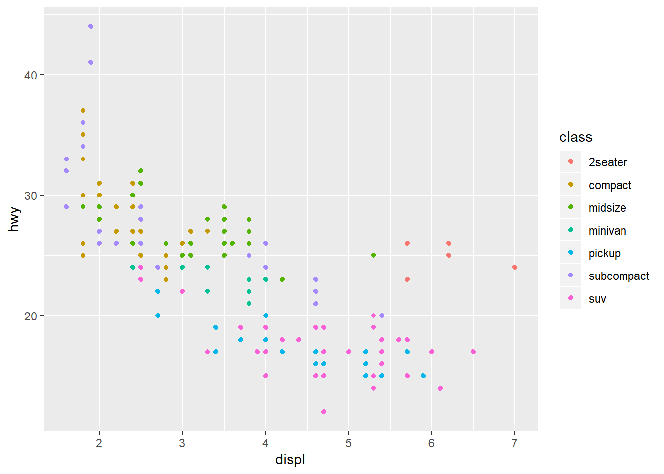
ggplot(data=mpg)+
  geom_point(mapping=aes(x=displ,y=hwy,size=class))
## Warning: Using size for a discrete variable is not advised.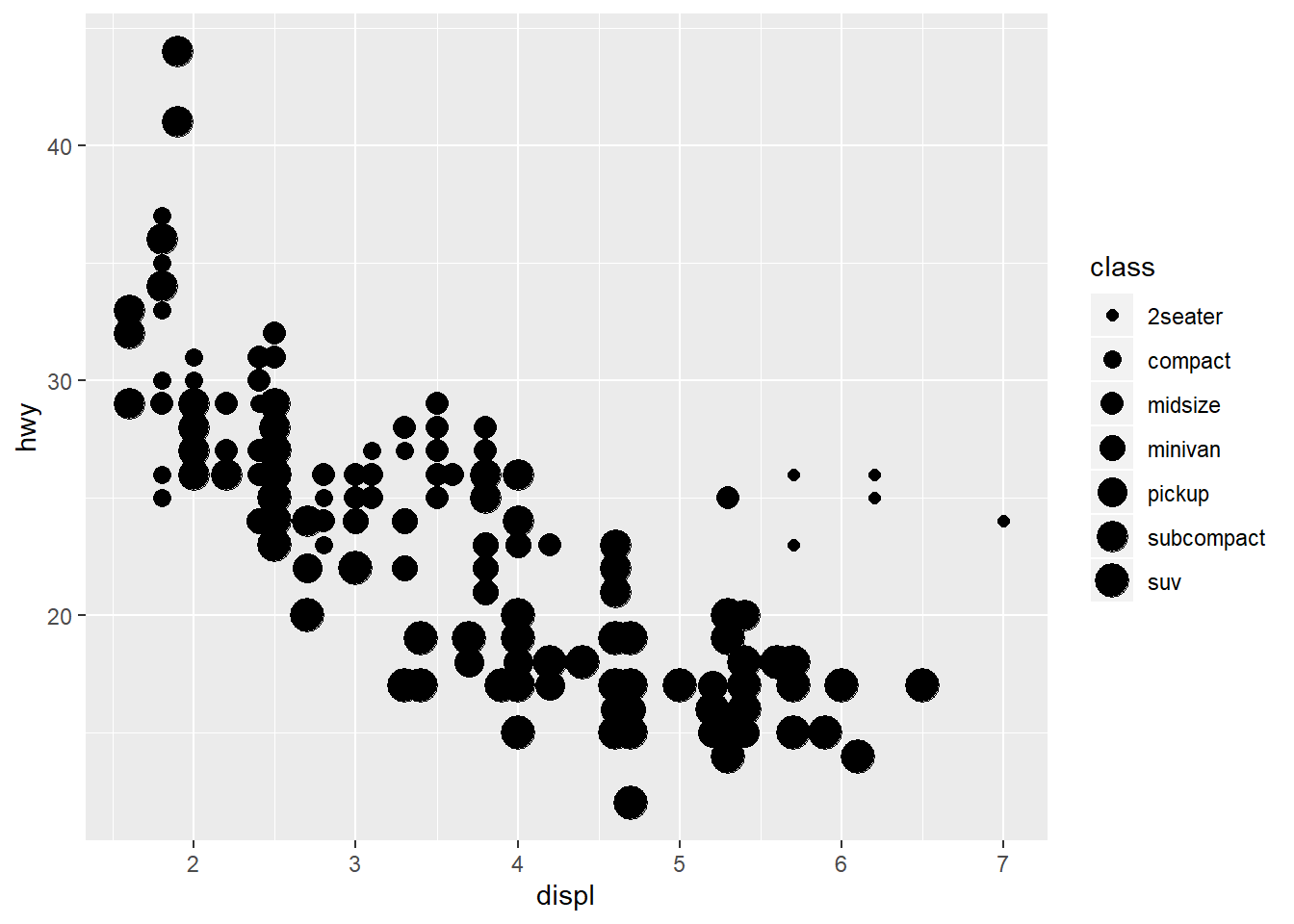
ggplot(data=mpg)+
  geom_point(mapping=aes(x=displ,y=hwy,alpha=class))
## Warning: Using alpha for a discrete variable is not advised.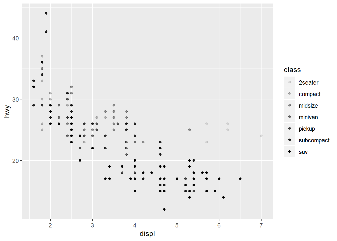
##maximum 6 shpaes at a time in ggplot2.
ggplot(data=mpg)+
  geom_point(mapping=aes(x=displ,y=hwy,shape=class))
## Warning: The shape palette can deal with a maximum of 6 discrete values because
## more than 6 becomes difficult to discriminate; you have 7. Consider
## specifying shapes manually if you must have them.
## Warning: Removed 62 rows containing missing values (geom_point).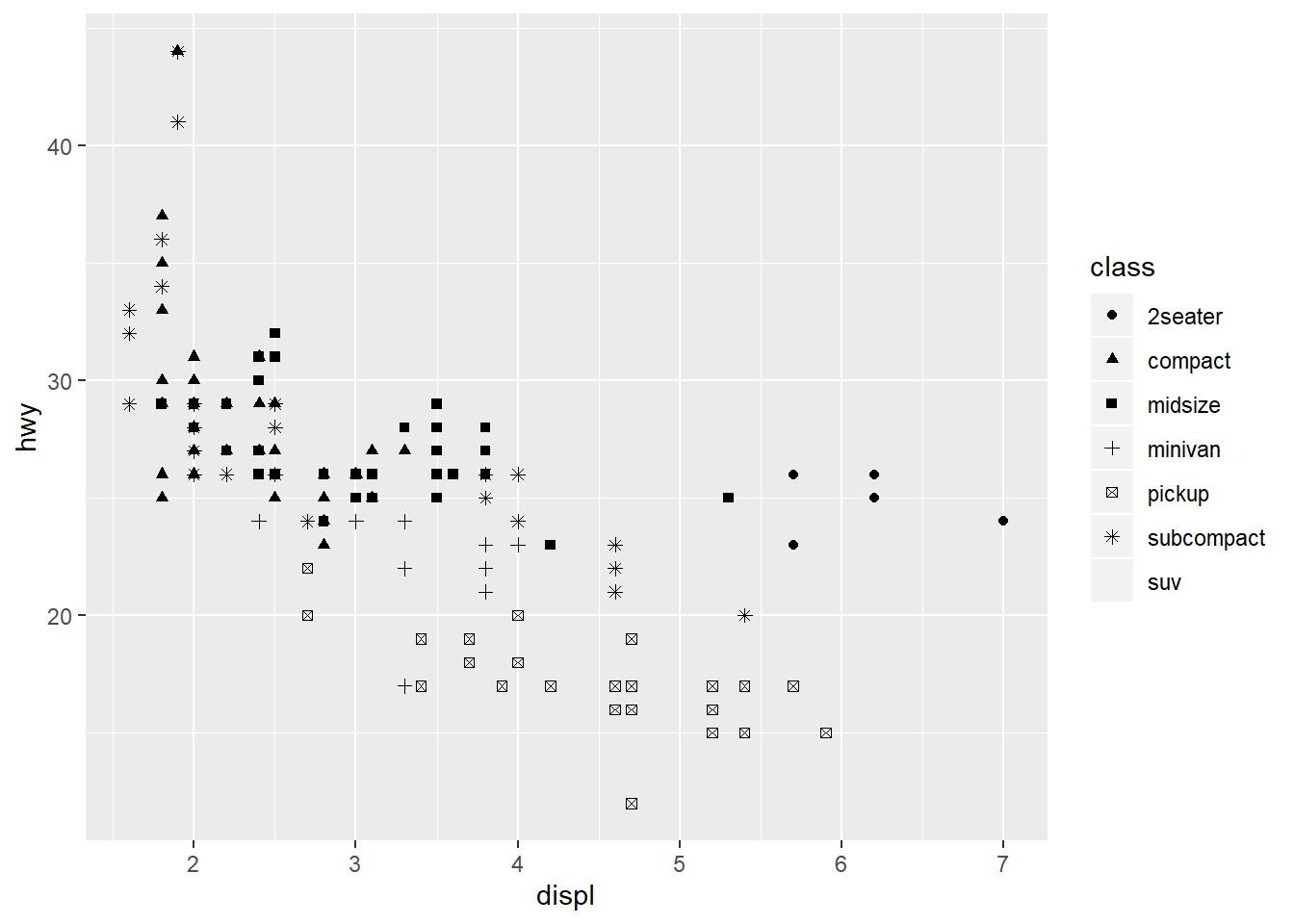
##This only replace the color label to be "blue"
ggplot(data=mpg)+
geom_point(mapping=aes(x=displ,y=hwy,color="blue"))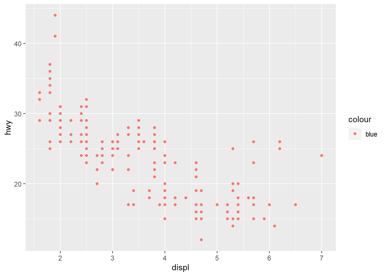 Using
Using Facets, facet the plot by a single variable, use facet_wrap(). Now, facet the plot by class variable. Type ?facet_wrap for more help.
ggplot(data = mpg)+
geom_point(mapping=aes(x=displ,y=hwy))+
facet_wrap(~ class, nrow = 1)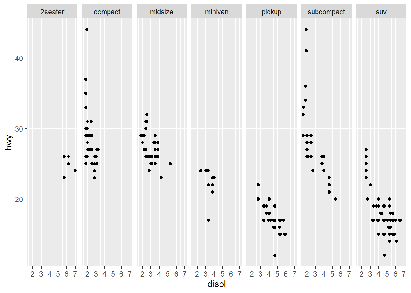 To facet two variables
 drv and cyl, use facet_grid() with variables seperated by ~.
ggplot(data=mpg)+
geom_point(mapping=aes(x=displ,y=hwy))+
facet_grid(drv~cyl)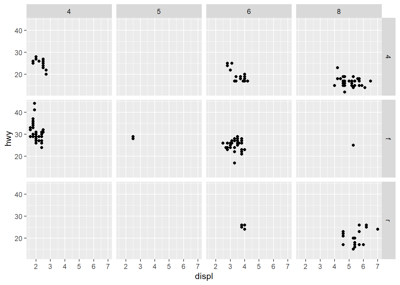 More with
 gemo_xxx plotting options, such linetype,‘group’
ggplot(data=mpg)+
  geom_smooth(mapping=aes(x=displ,y=hwy))
## `geom_smooth()` using method = 'loess' and formula 'y ~ x'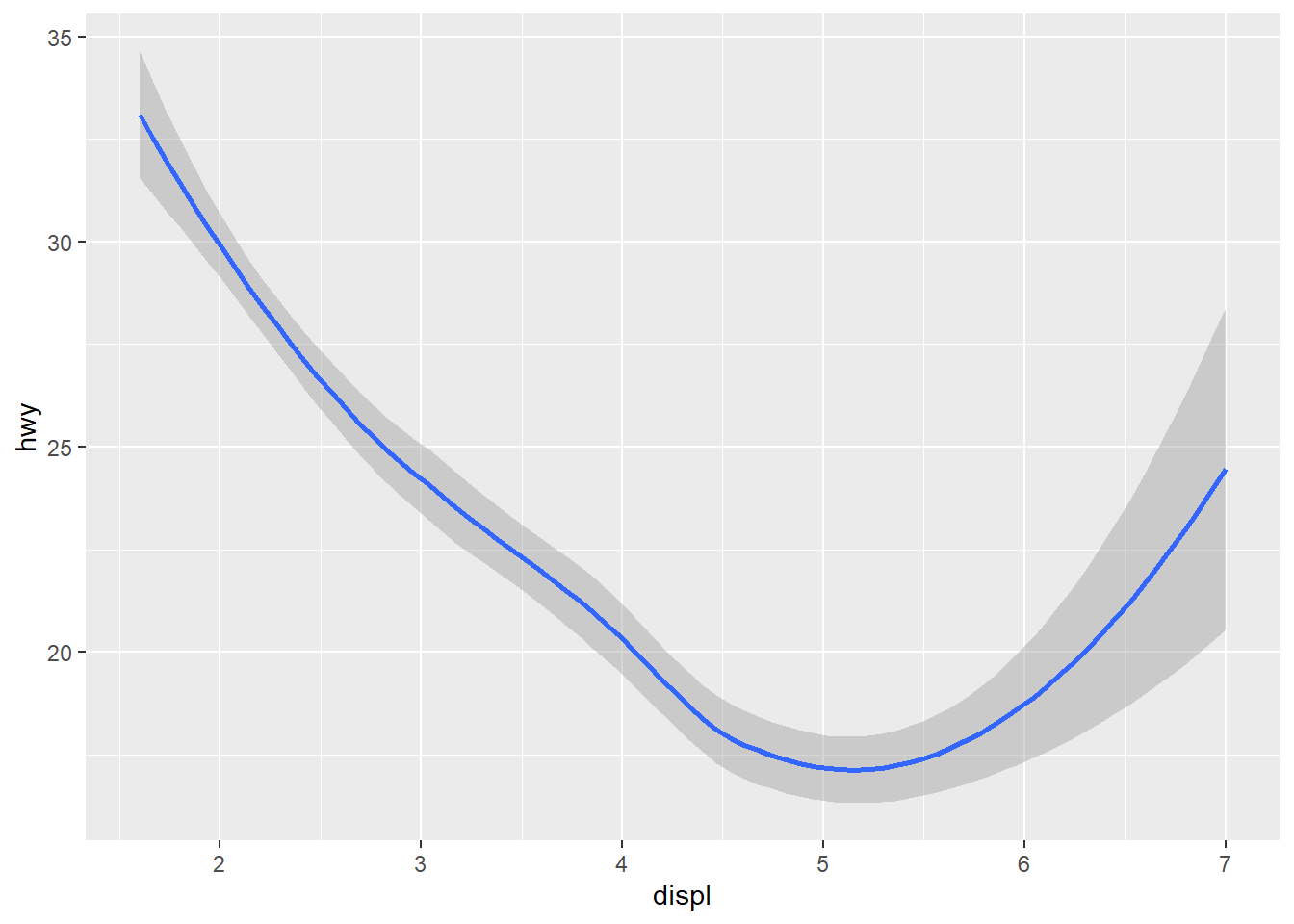
##Add 'drv' variable in the plot
ggplot(data=mpg)+
  geom_smooth(mapping=aes(x=displ,y=hwy,linetype=drv))
## `geom_smooth()` using method = 'loess' and formula 'y ~ x'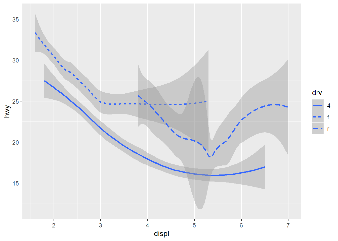
##add geom point as on top of it.
ggplot(data=mpg)+
geom_smooth(mapping=aes(x=displ,y=hwy,linetype=drv))+
geom_point(mapping=aes(x=displ,y=hwy,color=drv))
## `geom_smooth()` using method = 'loess' and formula 'y ~ x'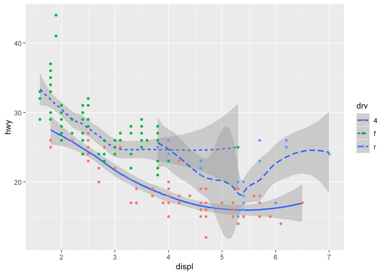 You typed
 aes(x=displ,y=hwy) more than once, to avoid duplication, you can try this code to generate the same plot.
ggplot(data=mpg,mapping=aes(x=displ, y=hwy))+
  geom_point(mapping = aes(color = drv))+
  geom_smooth(mapping =aes(linetype = drv))
## `geom_smooth()` using method = 'loess' and formula 'y ~ x'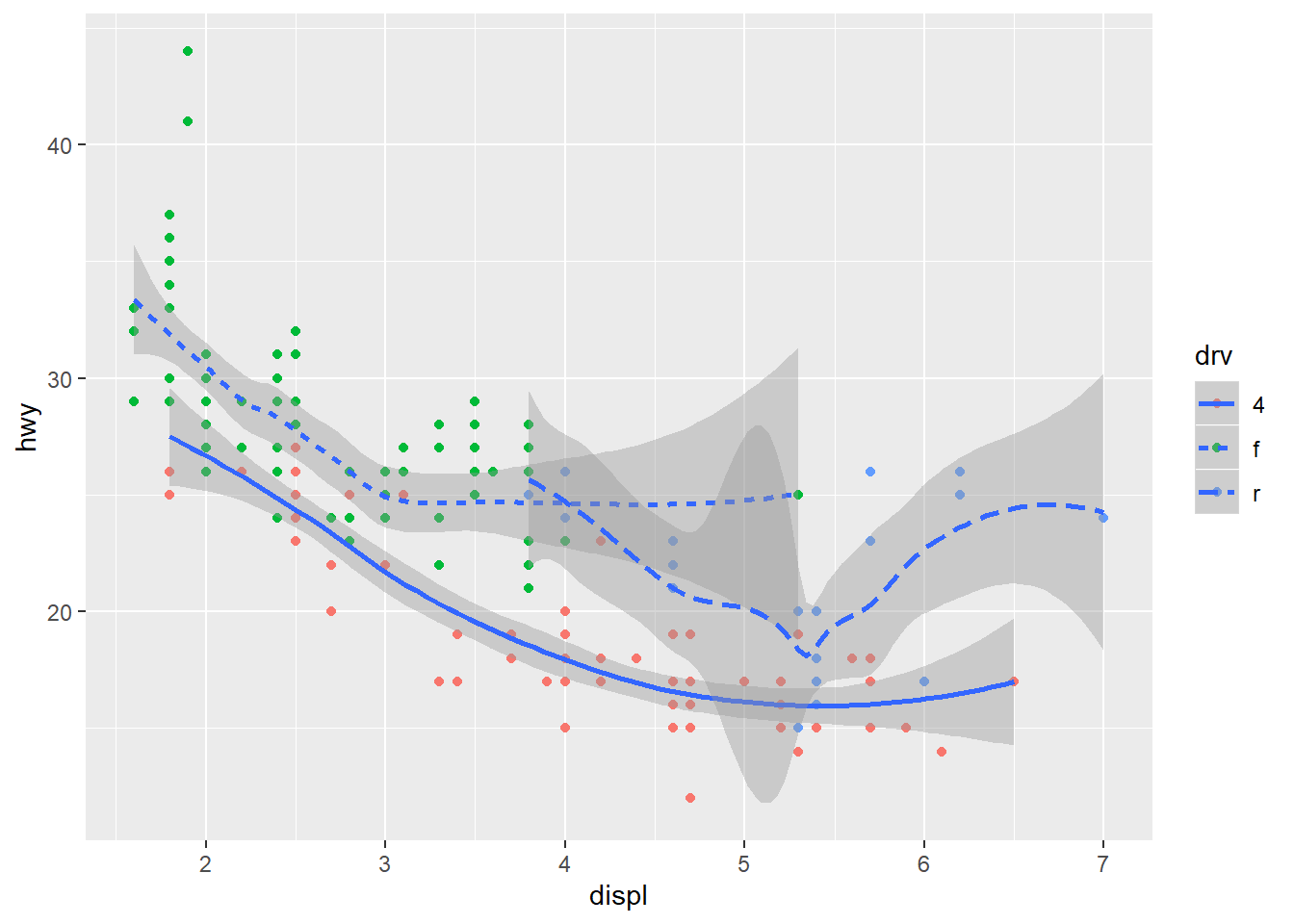
##Another example
ggplot(data=mpg,mapping=aes(x=displ,y=hwy))+
  geom_point(mapping = aes(color=class))+
  geom_smooth(se=FALSE)
## `geom_smooth()` using method = 'loess' and formula 'y ~ x'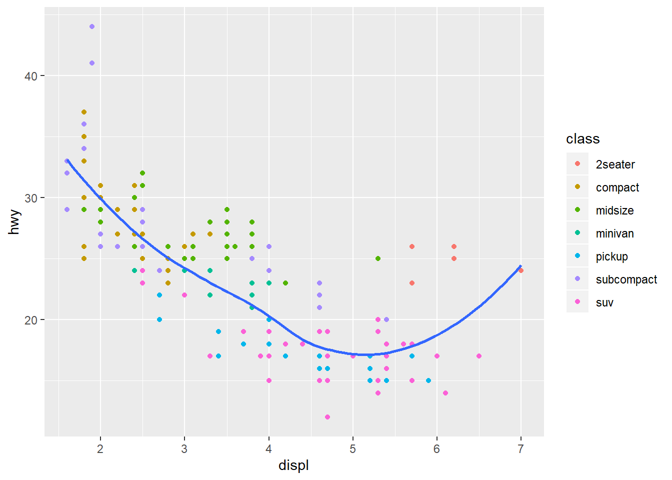
ggplot(data=mpg,mapping=aes(x=displ,y=hwy))+
  geom_point(mapping = aes(color=class))+
  geom_smooth(se=TRUE)
## `geom_smooth()` using method = 'loess' and formula 'y ~ x'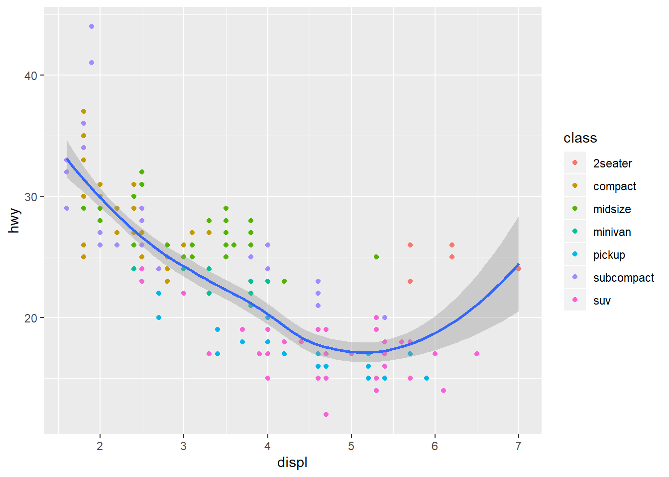
ggplot(data=mpg,mapping=aes(x=displ,y=hwy))+
  geom_point(mapping = aes(color=drv))+
  geom_smooth(se=FALSE,mapping=aes(color=drv))
## `geom_smooth()` using method = 'loess' and formula 'y ~ x'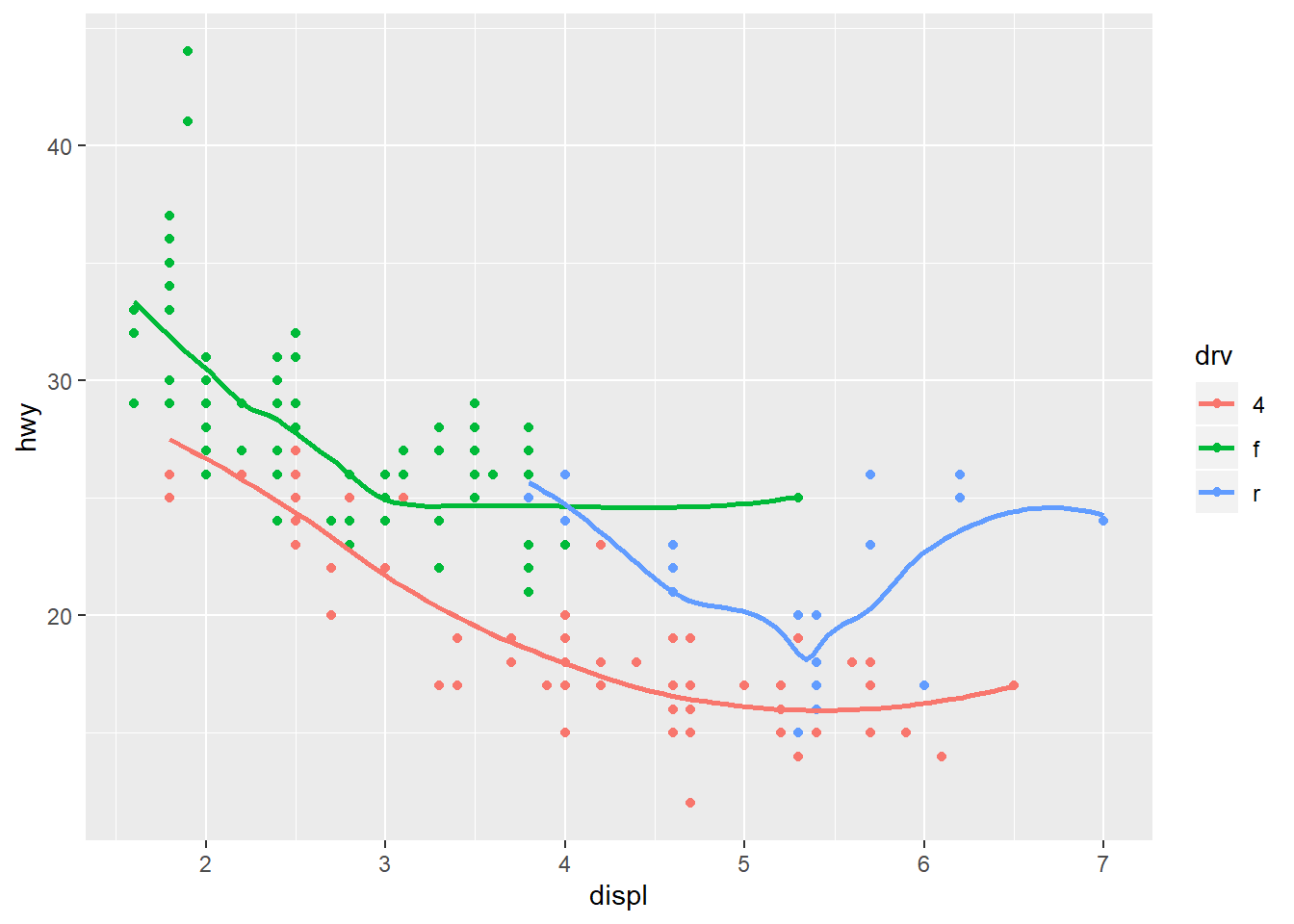
The diamonds dataset examples
From now on, we will try a different type of graph geom_bar(). The diamonds dataset comes in ggplot2 with round ~54,000 diamonds, including price,carat,color,clarity,and cut.
diamonds
## # A tibble: 53,940 x 10
##    carat cut       color clarity depth table price     x     y     z
##    <dbl> <ord>     <ord> <ord>   <dbl> <dbl> <int> <dbl> <dbl> <dbl>
##  1 0.23  Ideal     E     SI2      61.5    55   326  3.95  3.98  2.43
##  2 0.21  Premium   E     SI1      59.8    61   326  3.89  3.84  2.31
##  3 0.23  Good      E     VS1      56.9    65   327  4.05  4.07  2.31
##  4 0.290 Premium   I     VS2      62.4    58   334  4.2   4.23  2.63
##  5 0.31  Good      J     SI2      63.3    58   335  4.34  4.35  2.75
##  6 0.24  Very Good J     VVS2     62.8    57   336  3.94  3.96  2.48
##  7 0.24  Very Good I     VVS1     62.3    57   336  3.95  3.98  2.47
##  8 0.26  Very Good H     SI1      61.9    55   337  4.07  4.11  2.53
##  9 0.22  Fair      E     VS2      65.1    61   337  3.87  3.78  2.49
## 10 0.23  Very Good H     VS1      59.4    61   338  4     4.05  2.39
## # ... with 53,930 more rows
##draw a bar chart with counts by “cut"
ggplot(data=diamonds)+
  geom_bar(mapping=aes(x=cut))
ggplot(data=diamonds)+
  geom_bar(mapping=aes(x=cut,y=..count..))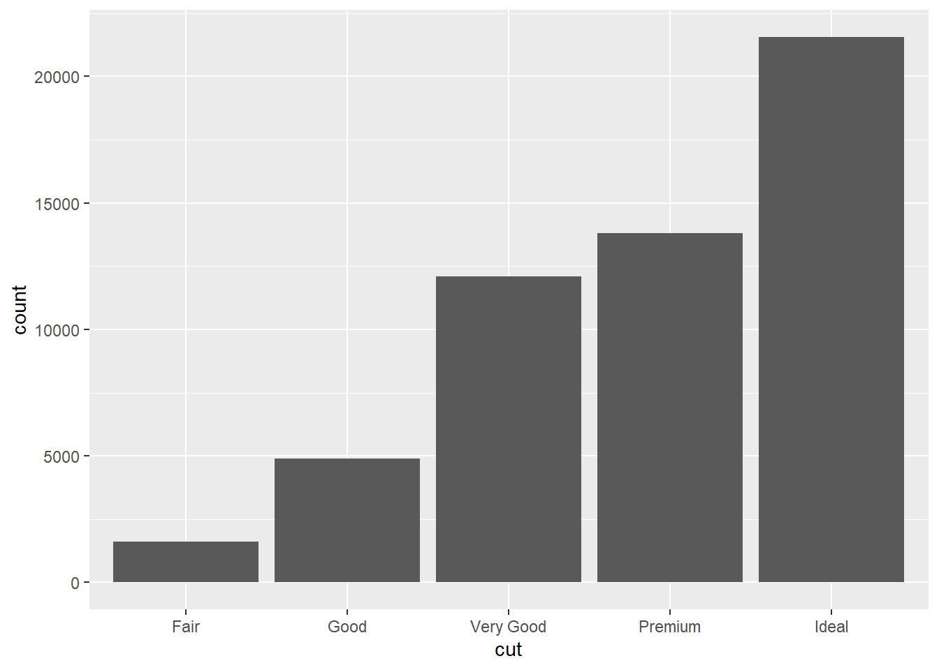
##draw a bar chart with counts by clarity
ggplot(data=diamonds)+
  geom_bar(mapping=aes(x=clarity))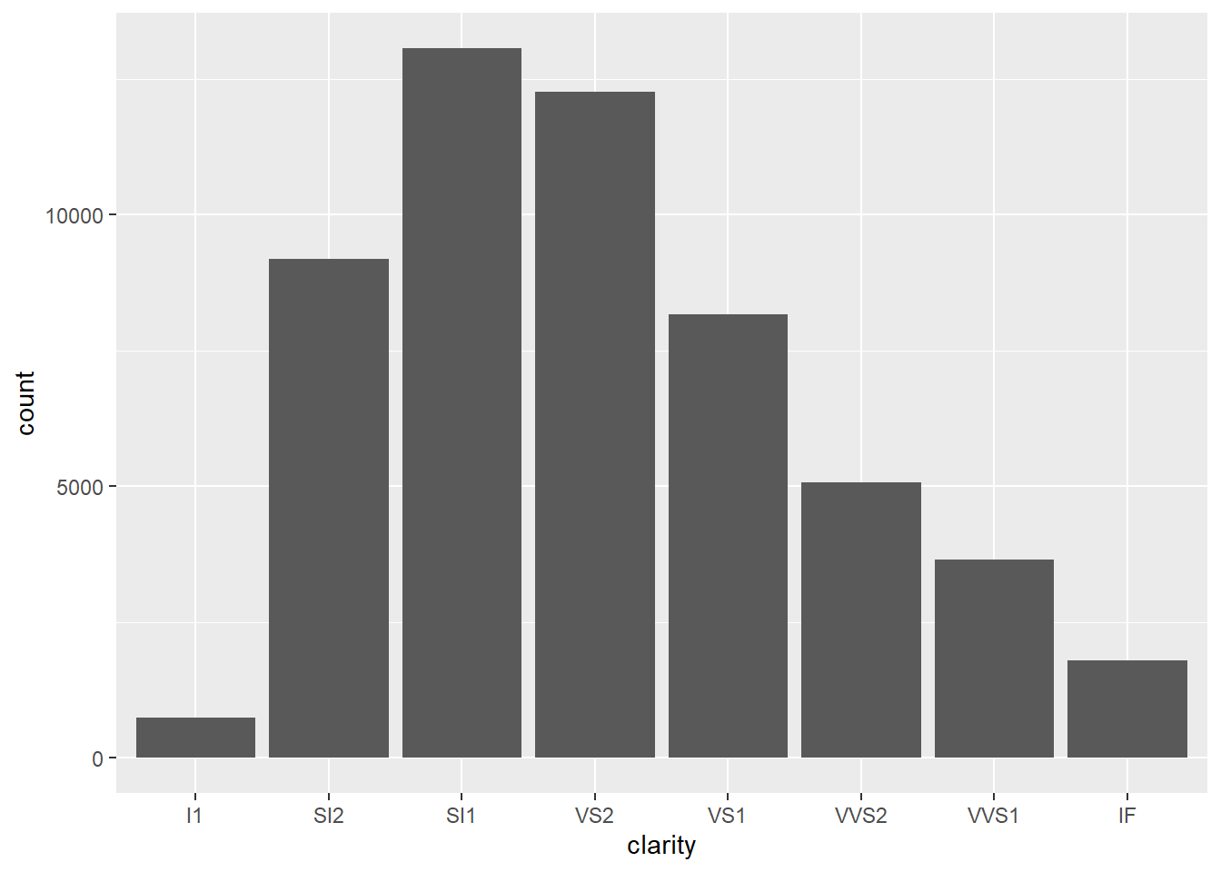
geom_bar() use stat_count by default, so the same plot can be plotted using this code:
  ggplot(data = diamonds)+
  stat_count(mapping = aes(x=cut))
To override the default stat_count setting (e.g. identify). See the following code as an example.
demo<-tribble(
~a,~b,
"bar_1",20,
"bar_2",30,
"bar_3",40)

## draw the plot
ggplot(data=demo)+
  geom_bar(mapping=aes(x=a,y=b),stat = "identity")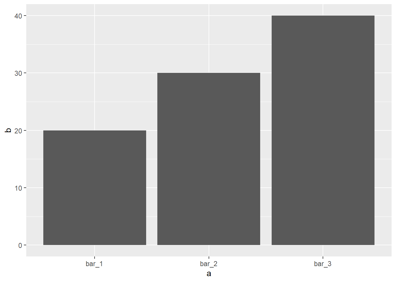
##draw the plot using geom_col, geom_col use "identity" as the default.
ggplot(data=demo)+
  geom_col(mapping=aes(x=a,y=b))
If you want to display the proportion, try this code:
# Way 1 (be sure to add the "group = 1" to overide the default option, otherwise it won't work)
ggplot(data=diamonds)+
  geom_bar(mapping=aes(x=cut,y=..prop..,group=1))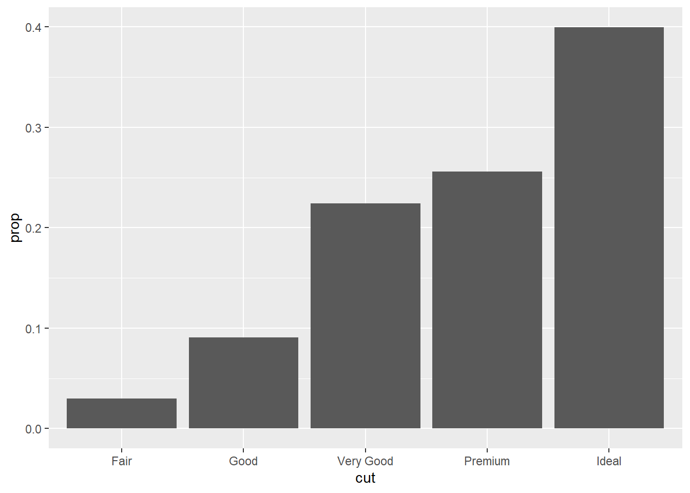
# Way 2 Another way is to use the "..count.."
ggplot(data=diamonds)+
  geom_bar(mapping=aes(x=cut,y=(..count..)/sum(..count..)))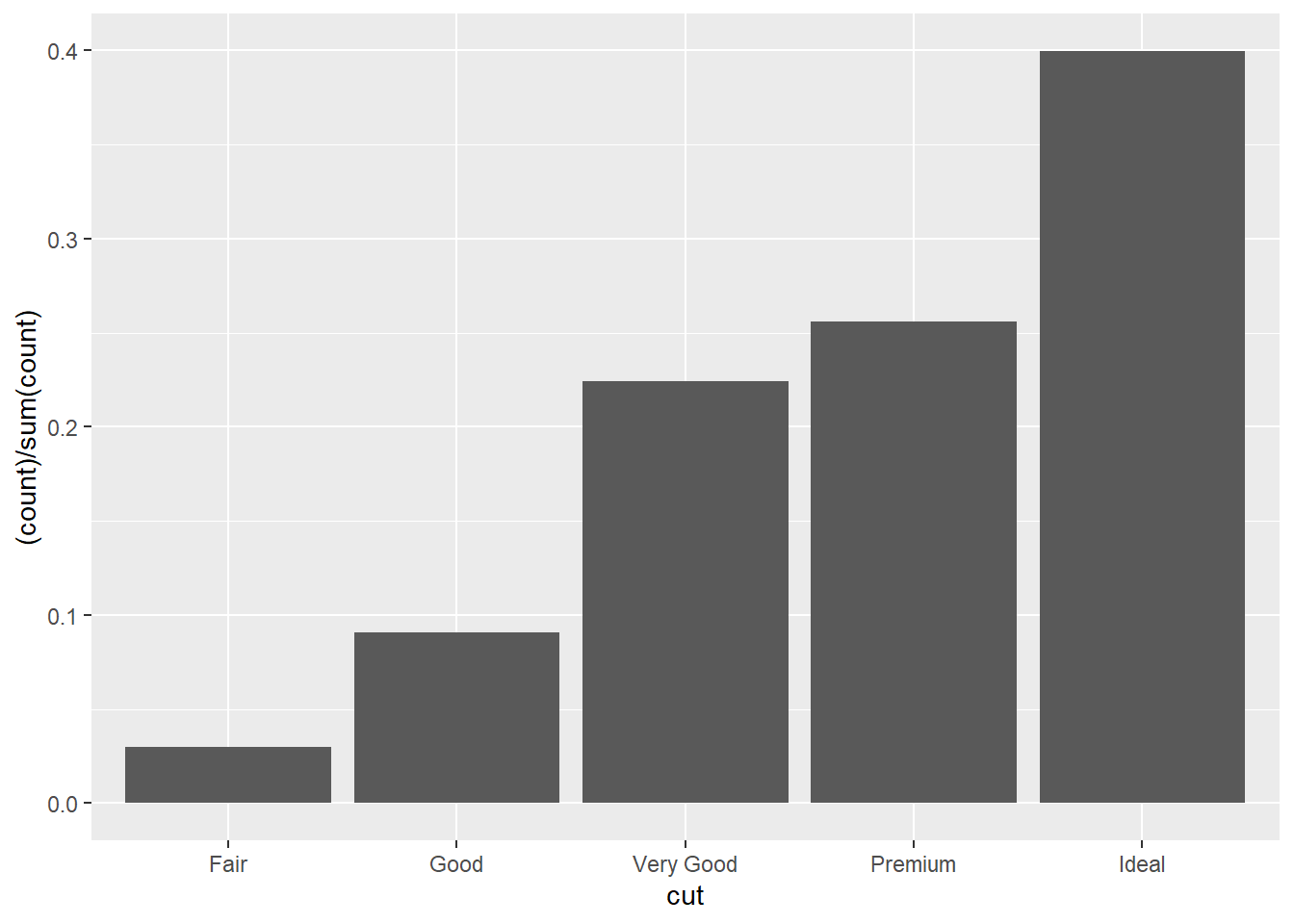
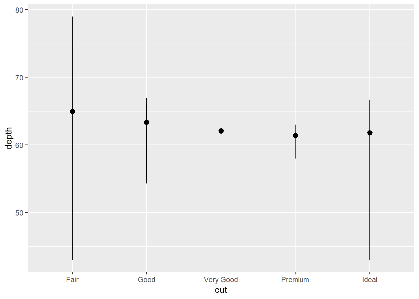
For bar plot, you might want to calculate or summarize statistics for each unique x value and draw attention to the summary. stat_summary() should be your choice. There are over 20 stats for you to use. I used stat_bin() on a continuous variable depth to showcase.
ggplot(data=diamonds)+
  stat_summary(
    mapping=aes(x=cut,y=depth),
    fun.ymin = min,
    fun.ymax = max,
    fun.y = median
  )
## stat_bin on a continuous variable with default bin_size = 30.
ggplot(data=diamonds)+
  stat_bin(
    mapping=aes(x=depth)
  )
## `stat_bin()` using `bins = 30`. Pick better value with `binwidth`.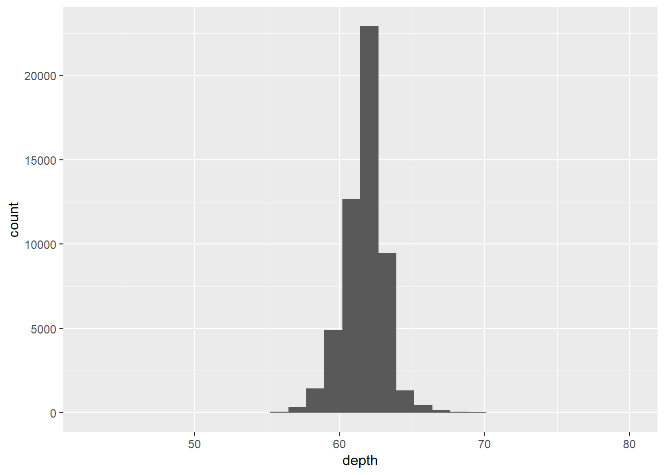
Position Adjustment and Coordinate Systems
Position Adjustment with either color or fill options.
ggplot(data=diamonds)+
  geom_bar(mapping=aes(x=cut,color=cut))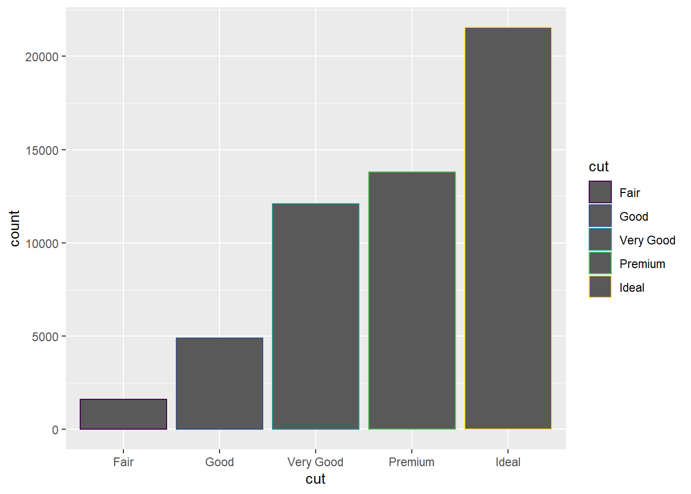
## try the "fill" option
ggplot(data=diamonds)+
  geom_bar(mapping=aes(x=cut,fill=cut))
##try the "fill option with a different categorial variable
ggplot(data=diamonds)+
  geom_bar(mapping=aes(x=cut,fill=clarity))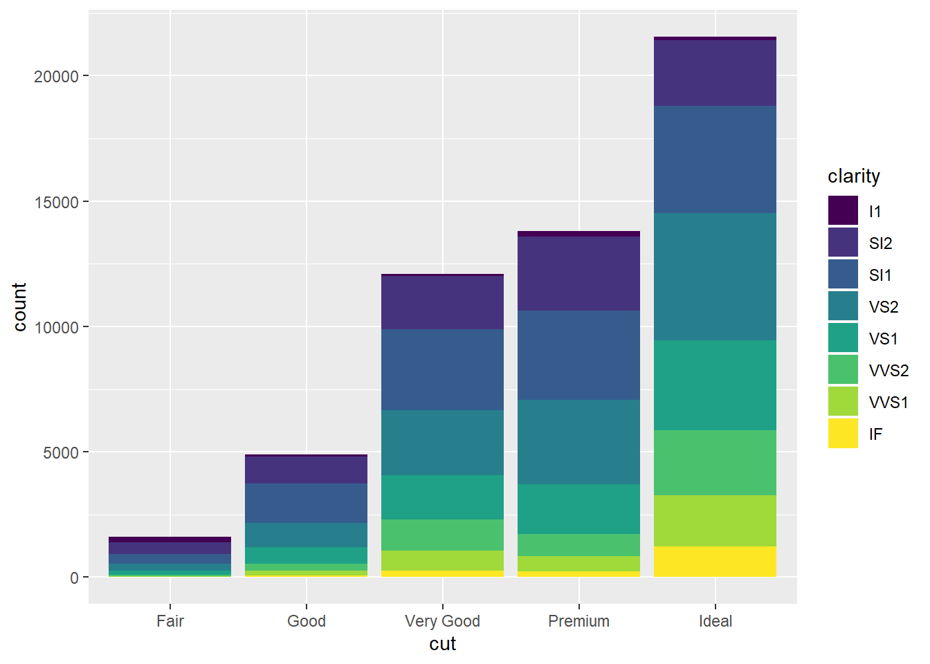
## if you don't want a stacked bar chart, try one of the three options with "position = identity", "dodge", or "fill"
ggplot(data=diamonds)+
  geom_bar(mapping=aes(x=cut,fill=clarity),
  position = "fill")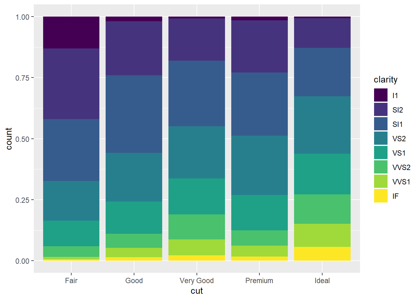
## position = "dodged".
ggplot(data=diamonds)+
  geom_bar(mapping=aes(x=cut,fill=clarity),
position = "dodge") 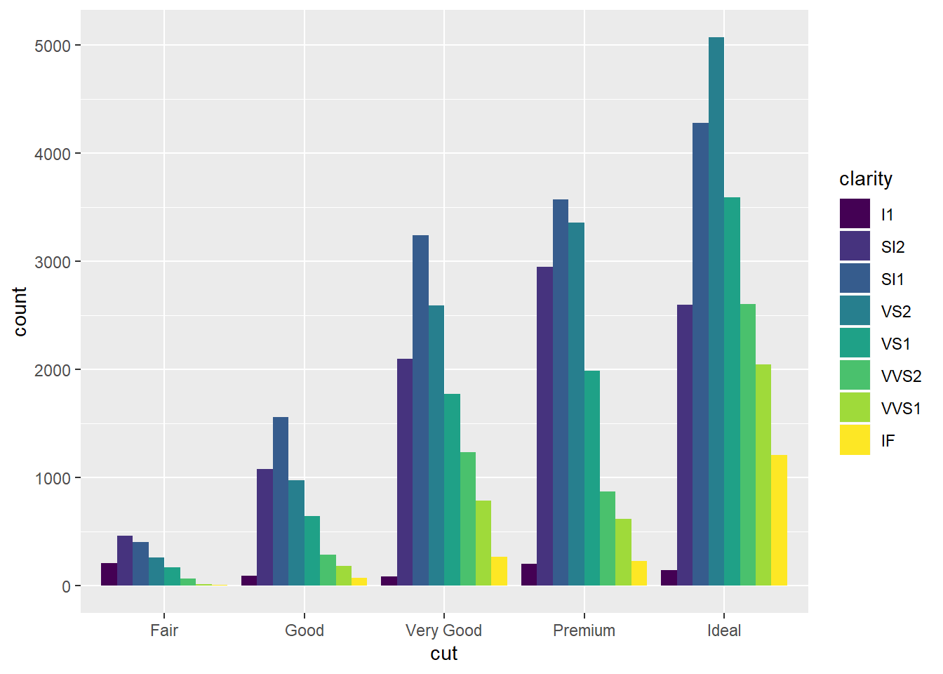
## try position = "identity"
ggplot(data=diamonds)+
  geom_bar(mapping=aes(x=cut,fill=clarity),
position = "identity") 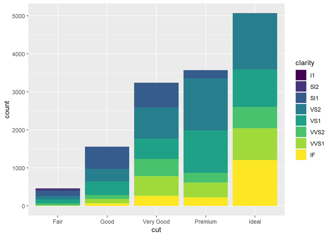
Position adjustment can also be useful for scatterplot for 2 discrete variables where their values might be overplotting or on top of each other. See this code as an example using jitter which will add random noise to improve your plot:
ggplot(data=mpg)+
geom_point(mapping=aes(x=displ,y=hwy),
position ="jitter")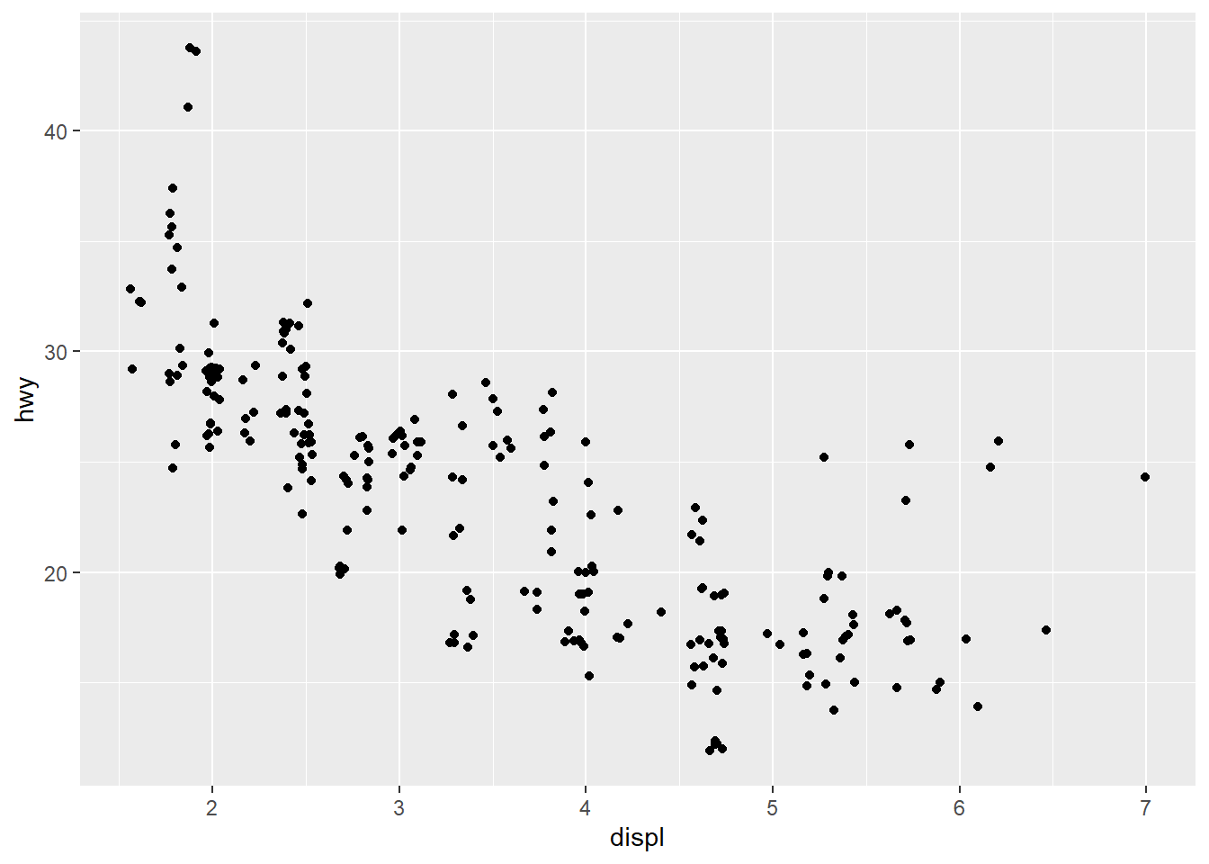 Coordinate System: flip the axis using `coord_flip() for neater display.
Let’s try a boxplot as an example.
Coordinate System: flip the axis using `coord_flip() for neater display.
Let’s try a boxplot as an example.
ggplot(data=mpg,mapping=aes(x=class,y=hwy))+
  geom_boxplot()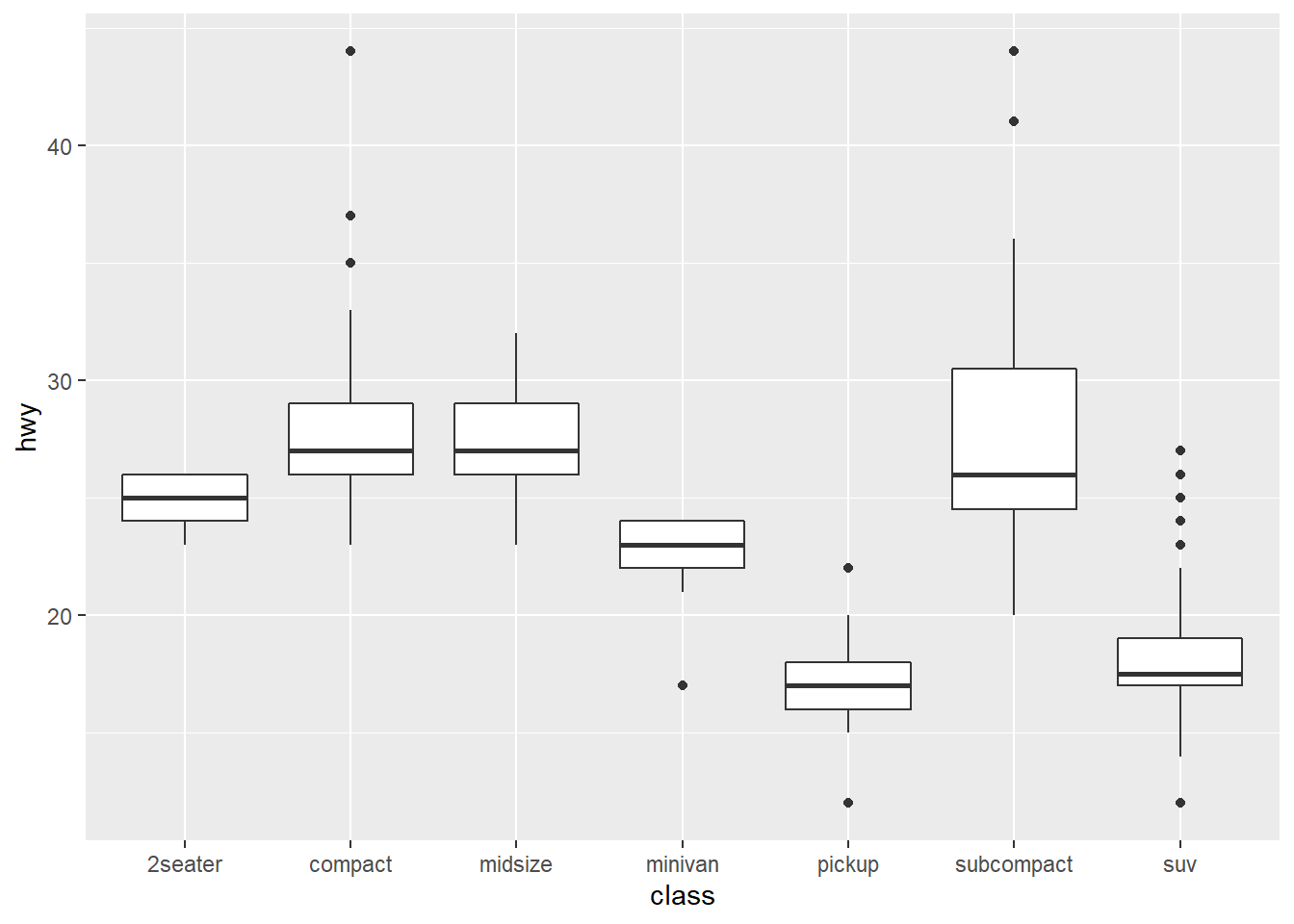
##flip coordinates
ggplot(data=mpg,mapping=aes(x=class,y=hwy))+
geom_boxplot()+
coord_flip()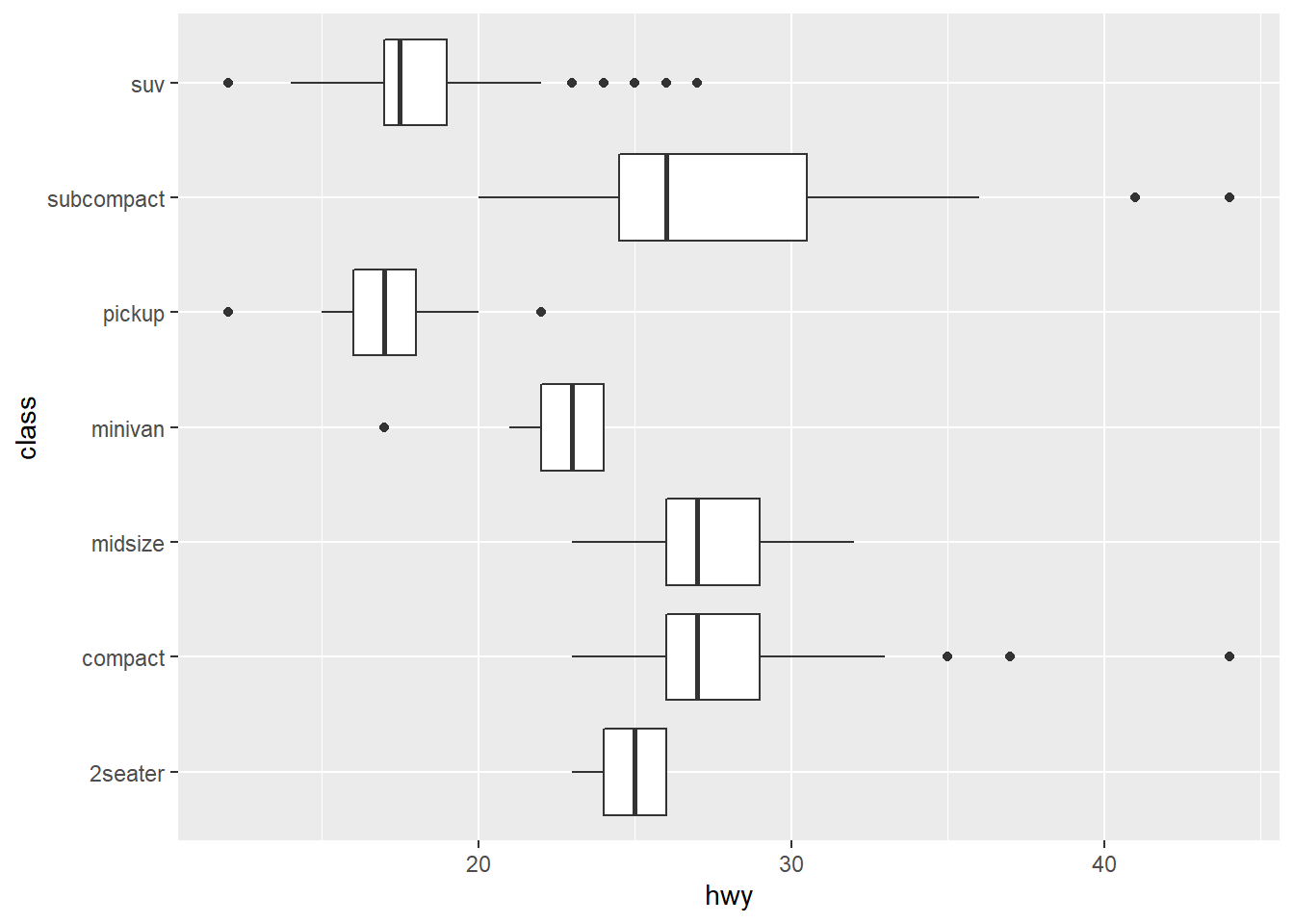 For maps, you might need to use
 coord_polar() for polar coordinates, or coord_quickmap() to set the aspect ratio for a map.
Here is an example to turn stacked bar chart into a pie chart using coord_polar().
bar<-ggplot(data=diamonds)+
  geom_bar(aes(x=cut,fill=cut),width = 1)

bar + coord_flip()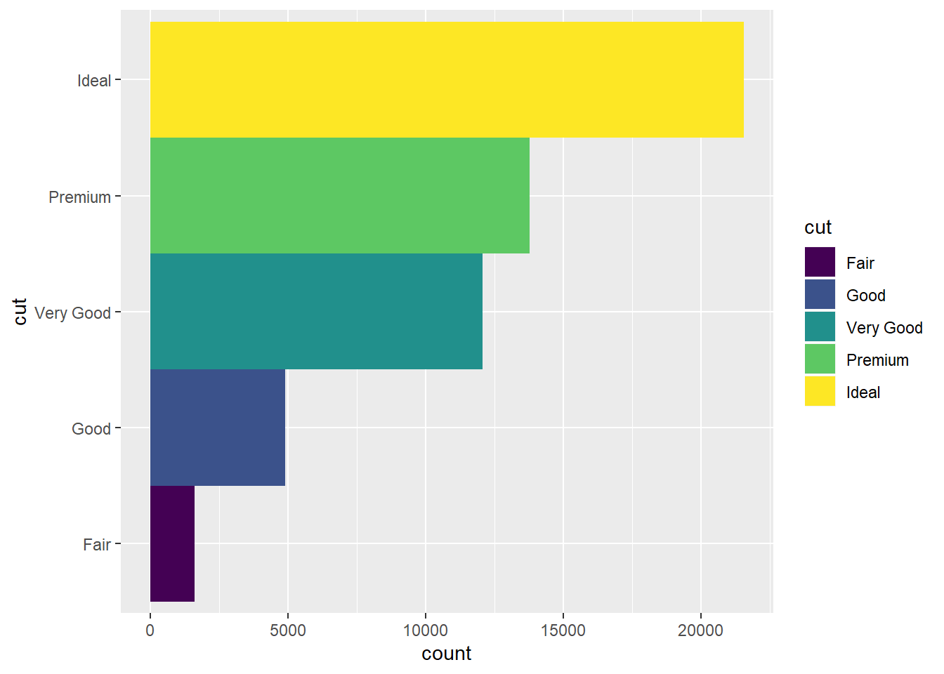
bar + coord_polar()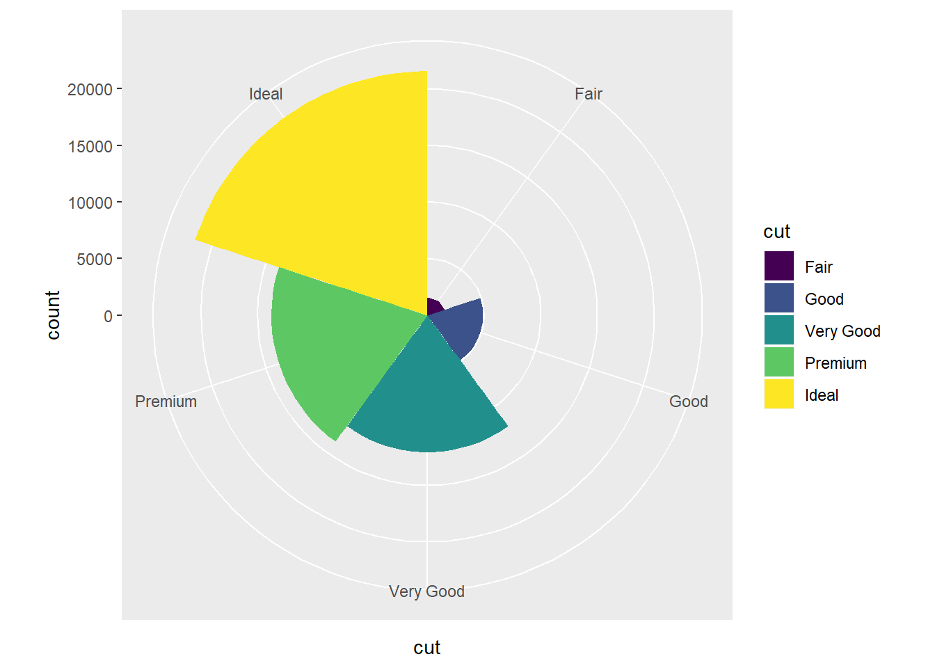
###Summary on ggplot The layered Grammar of Graphics
ggplot(data=<DATA>)+
  <geom_function>(mapping=aes(<mapping>),
                  stat=<STAT>,
                  position=<POSITION>
                  )+
  <COORDINATE_FUNCTION>+
  <FACET_FUNCTION>
Exercice using diamonds dataset.
- Compute count for each
cutvalue.
ggplot(data=diamonds)+
  stat_count(mapping=aes(x=cut))
2. Fill each bar with a color.
ggplot(data=diamonds)+
  stat_count(mapping=aes(x=cut,fill=cut))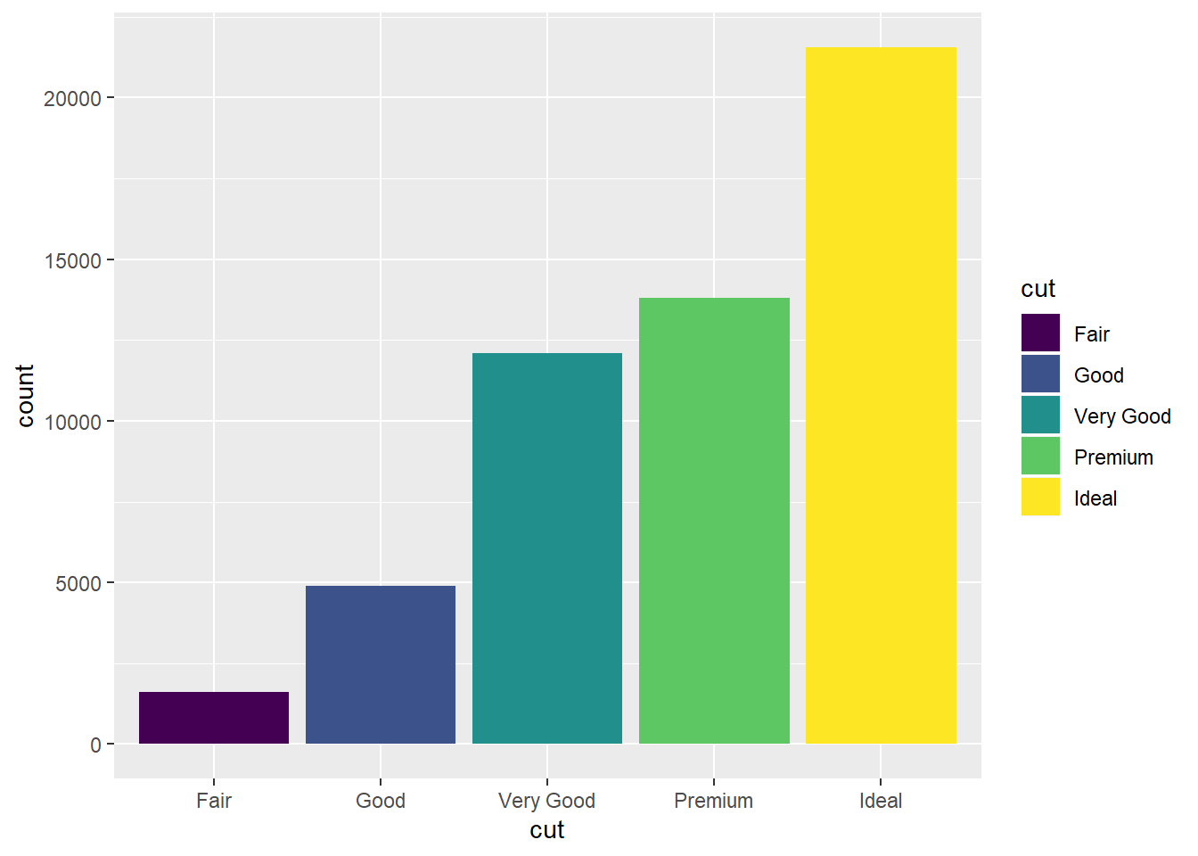
- Calcuate the proption by
clarityvariable.
ggplot(data=diamonds)+
  geom_bar(mapping=aes(x=clarity,y=..prop..,group = 1))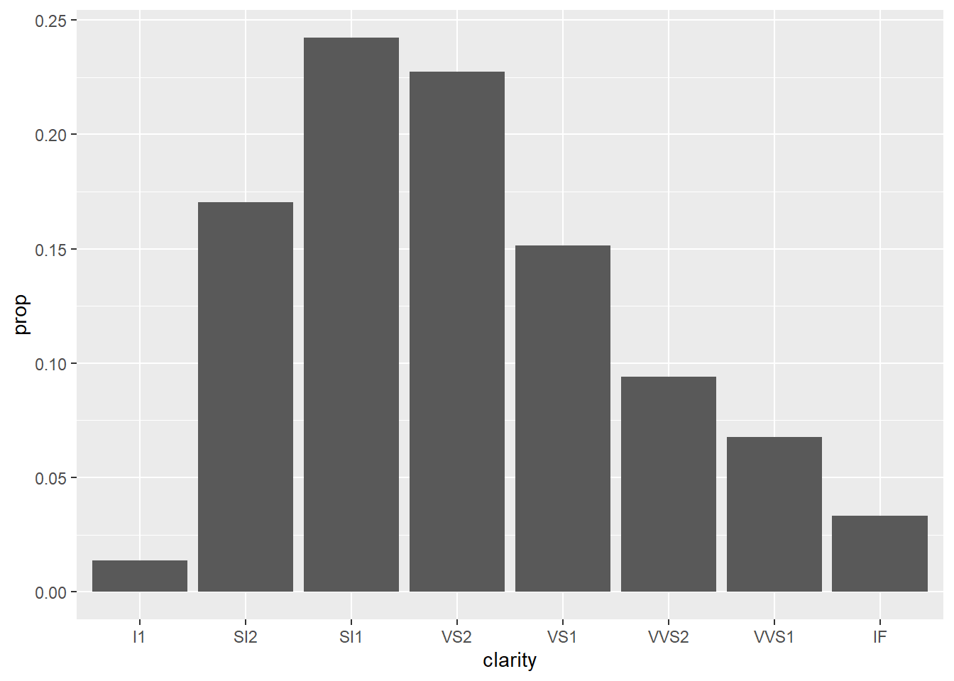
2. Workflow:Basics & Shortcuts (print,<-,Alt+Shift+K,tab)
It is useful to remember a few most-used shortcuts.
z <- seq(1,10,length.out = 8)
##Print to screen
(z <- seq(1,10,length.out = 8))
## [1]  1.000000  2.285714  3.571429  4.857143  6.142857  7.428571  8.714286
## [8] 10.000000
3. Data Transformation with dplyr
###Filter Rows with filter()
###Reorder/sort the rows with arrange()
###Pick variables by names with select()
###Create new variables with functions of existing variables with mutate()
###Collapse many values to a summary statistics with summarize()
Workflow scripts and Exploratory Data Analysis
Last updated on Jan 6, 2018. To be continued…